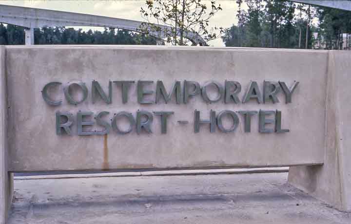
NEXT STOP....THE CONTEMPORARY RESORT HOTEL!!!
well, it just doesn't get much cooler than the swanky mod-super stylings of Walt Disney World's original 1971 masterpiece, the Contemporary Hotel!
first, thanks for all the nice e-mails. i'm amazed how many people you can reach with one of these blog thinghies! i guess i'd better act responsible and start posting!
i love the overall styling of WDW in it's formative years. up until recently, WDW was laughed at for it's 70s cheesiness. with time, that campy 70s style has grown more and more appreciated as a unique progression of the 1960s pop movement.
it just goes to show what incredible designers were working at WED in the 60s and 70s. these people were at the epicenter of style and design for that era. they had a whole 'world' to display their great taste with the Florida Project. what's even better, is that WED designers such as John Hench, George McGinnis and Mary Blair were doing what animation stylists did in cartoons...taking what was going on around them and caricaturing it on film...in this case, functional architecture. what you see in early WDW is their commentary on what was happening in fashion, art and technology of the time.
many places in WDW featured themed futruism with a contemporary flair. none more so than this joint...
man, i LOVED the Contemporary Hotel! now, the Polynesian was absolutely my favorite but the Contemporary was right up there.

in Walt's plan, the hotels on the WDW property were to carry through the Disney themed environment philosophy. more than simply slumber palaces, they were conceived to transport you into a specific themed setting. that's why they went heavy on the "Resort" nomenclature in all of the marketing (Polynesian Resort Hotel, Contemporary Resort Hotel, Fort Wilderness Resort, etc). cool, huh?
several hotels were part of the initial planning. some of the unrealized hotels included an Asian resort and an early American/Cape Cod Bay resort.
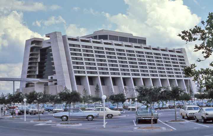
working with long time Disney partner and architect, Welton Beckett, the Contemporary was to showcase the atmosphere of today with the conveinence and case-study building techniques of the future. quasi sponsorship was provided by United States Steel as well as manufacturing.
the idea was to have a hotel that would be inexpensive to construct and yet grab the attention of the world audience. concepts usually lead to more concepts. Disney's initial team of artists were confident enough to start an idea and see where it took them. this hotel is certainly one of those!
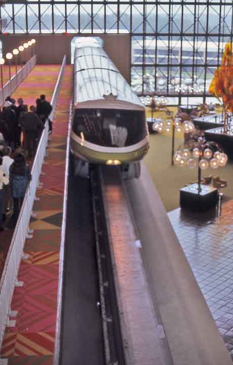
 the idea of having the WDW monorail system run through the center of the hotel was an added feature that eventually dictated the architectural configuration. that configuration then lead to the massive atrium to take advantage of the dramatic use of an
 indoor monorail system.
absolutely theatrical...and something that could only be done by Disney in this 'experimental' city. remember, the whole Florida property was part of the EPCOT project. the theme park and hotels were Phase One of the experiment. okay, sorry...back to the hotel!
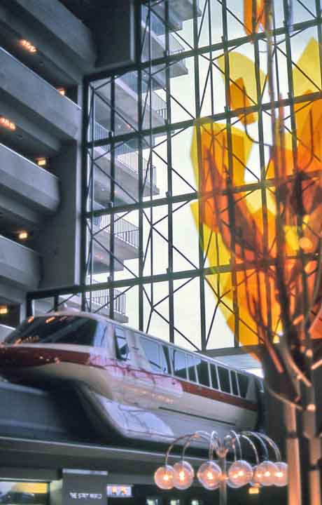
the hotel's theme grew out of the impression it's canyon-like atrium projected. thus, the Grand Canyon Concourse concept was developed. the system of two sides of the buildings 'leaning' inward is how the effect was created. in doing this, each floor would have an incredible view of this 'canyon' from each balconied level. with no interior wall space, a tower was needed for the elevator system. for some, this giant walled in structure would pose a problem for the grand atrium effect. this is where Disney stylist Mary Blair was brought in. she was commissioned to create a towering mosaic mural using the theme of the Grand Canyon. what she came up with is the world's largest hand made mosaic featuring modernistic southwest themes. her designs of southwest indian children were used throughout the resort, in the lobbies and in each of the hotels rooms.
 the ground floor, located just below the grand concourse level (where the monorail loaded) contained retail and dining space. it too was pretty neat. modular lighting and seating which screamed early 70s pop. accenting this cool insanity were plexi glass trees using warm colors such as yellow, red and orange! taking advantage of the naturally lit atrium, 'stained plastic' was used throughout the space.
 well, all good things come to an end and the Contemporary went through several make-overs. in the mid eighties, the beauty you see above was torn out and things were never the same. the Mary Blair mural is still there but that's about it from the original, southwest theme. it's been many years since i've been back. as i recall in the late 90s, i was shocked at how soul-less and generic the interior design had become. it looked like service counter at a Target store. dark blue carpets which just suck up the natural light and i couldn't tell you what the theme was...i felt like i was in an eastern bloc bank.

the good thing is the initial building plan is so great, so innovative and solid that it can easily be returned to it's stylistic glory.
i'm not one for replicating what was there, but rather getting the top interior stylists involved at Imagineering and letting them go to town. it wouldn't even be that expensive! look how simply the original was done!
well, it just doesn't get much cooler than the swanky mod-super stylings of Walt Disney World's original 1971 masterpiece, the Contemporary Hotel!
first, thanks for all the nice e-mails. i'm amazed how many people you can reach with one of these blog thinghies! i guess i'd better act responsible and start posting!
i love the overall styling of WDW in it's formative years. up until recently, WDW was laughed at for it's 70s cheesiness. with time, that campy 70s style has grown more and more appreciated as a unique progression of the 1960s pop movement.
it just goes to show what incredible designers were working at WED in the 60s and 70s. these people were at the epicenter of style and design for that era. they had a whole 'world' to display their great taste with the Florida Project. what's even better, is that WED designers such as John Hench, George McGinnis and Mary Blair were doing what animation stylists did in cartoons...taking what was going on around them and caricaturing it on film...in this case, functional architecture. what you see in early WDW is their commentary on what was happening in fashion, art and technology of the time.
many places in WDW featured themed futruism with a contemporary flair. none more so than this joint...
man, i LOVED the Contemporary Hotel! now, the Polynesian was absolutely my favorite but the Contemporary was right up there.
in Walt's plan, the hotels on the WDW property were to carry through the Disney themed environment philosophy. more than simply slumber palaces, they were conceived to transport you into a specific themed setting. that's why they went heavy on the "Resort" nomenclature in all of the marketing (Polynesian Resort Hotel, Contemporary Resort Hotel, Fort Wilderness Resort, etc). cool, huh?
several hotels were part of the initial planning. some of the unrealized hotels included an Asian resort and an early American/Cape Cod Bay resort.
working with long time Disney partner and architect, Welton Beckett, the Contemporary was to showcase the atmosphere of today with the conveinence and case-study building techniques of the future. quasi sponsorship was provided by United States Steel as well as manufacturing.
the idea was to have a hotel that would be inexpensive to construct and yet grab the attention of the world audience. concepts usually lead to more concepts. Disney's initial team of artists were confident enough to start an idea and see where it took them. this hotel is certainly one of those!
 the idea of having the WDW monorail system run through the center of the hotel was an added feature that eventually dictated the architectural configuration. that configuration then lead to the massive atrium to take advantage of the dramatic use of an
 indoor monorail system.
absolutely theatrical...and something that could only be done by Disney in this 'experimental' city. remember, the whole Florida property was part of the EPCOT project. the theme park and
 hotels were Phase One of the experiment. okay, sorry...back to the hotel!
the hotel's theme grew out of the impression it's canyon-like atrium projected. thus, the Grand Canyon Concourse concept was developed. the system of two sides of the buildings 'leaning' inward is how the effect was created. in doing this, each floor would have an incredible view of this 'canyon' from each balconied level.
 with no interior wall space, a tower was needed for the elevator system. for some, this giant walled in structure would pose a problem for the grand atrium effect. this is where Disney stylist Mary Blair was brought in. she was commissioned to create a towering mosaic mural using the theme of the Grand Canyon. what she came up with is the world's largest hand made mosaic featuring modernistic southwest themes. her designs of southwest indian children were used throughout the resort, in the lobbies and in each of the hotels rooms.
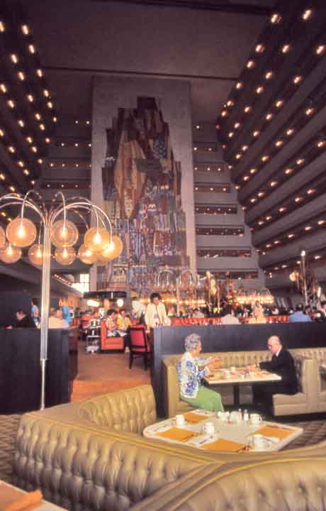 the ground floor, located just below the grand concourse level (where the monorail loaded) contained retail and dining space. it too was pretty neat. modular lighting and seating which screamed early 70s pop. accenting this cool insanity were plexi glass trees using warm colors such as yellow, red and orange! taking advantage of the naturally lit atrium, 'stained plastic' was used throughout the space.
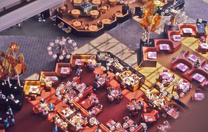 well, all good things come to an end and the Contemporary went through several make-overs. in the mid eighties, the beauty you see above was torn out and things were never the same. the Mary Blair mural is still there but that's about it from the original, southwest theme. it's been many years since i've been back. as i recall in the late 90s, i was shocked at how soul-less and generic the interior design had become. it looked like service counter at a Target store. dark blue carpets which just suck up the natural light and i couldn't tell you what the theme was...i felt like i was in an eastern bloc bank.
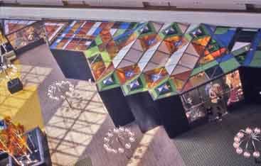
the good thing is the initial building plan is so great, so innovative and solid that it can easily be returned to it's stylistic glory.
i'm not one for replicating what was there, but rather getting the top interior stylists involved at Imagineering and letting them go to town. it wouldn't even be that expensive! look how simply the original was done!
posted by thepicklebarrel at 1:25 AM
![]()


4 Comments:
I've always heard that, as a hotel, the Contemporary wasn't that hot (this from finicky friends), but it is such an icon of the Florida park that it is where I would want to stay. If I could afford it!
Last time I was there I ate in the restaurant in the lobby and it was very sterile. I think Disney has tried to go to standardization and there is no more uniqueness at most of their hotels.
actually patrick, i think there's a lot of good stuff done today. from what i've seen of Animal Kingdom lodge it looks VERY theme park and also like they spared no expense.
i know from seeing them that the Wilderness Lodge and The Grand Floridian are absolutely fantastic. the definitely transport you to the theme they are trying too.
it's just that when they don't care (with something old like the Contemporary) they seem to just hack it out. and then they wonder why they can't fill rooms.
see! i'm not filled with hatred for ALL the new stuff!
Staying at the Contemporary in 1985 was my dream come true. But they had already begun to monkey with it by then.
It is pathetic how the Management has neglected it. My last visit in 2004 found the cursed ubiquitous mauve grey color scheme. Thank God it is under renovation (again) hopefully this time will be a return to the Greatness of the past!
Post a Comment
<< Home